01
Turning visual identity into a system
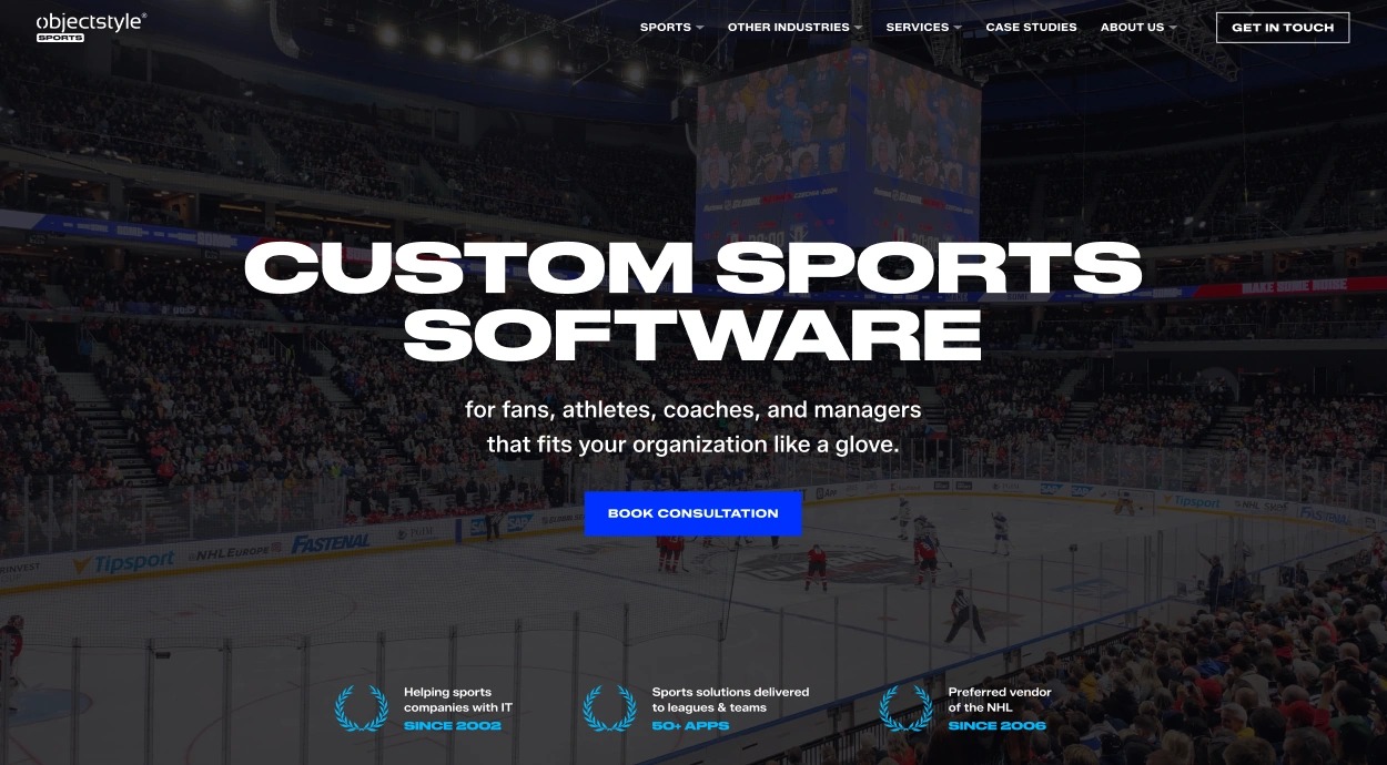
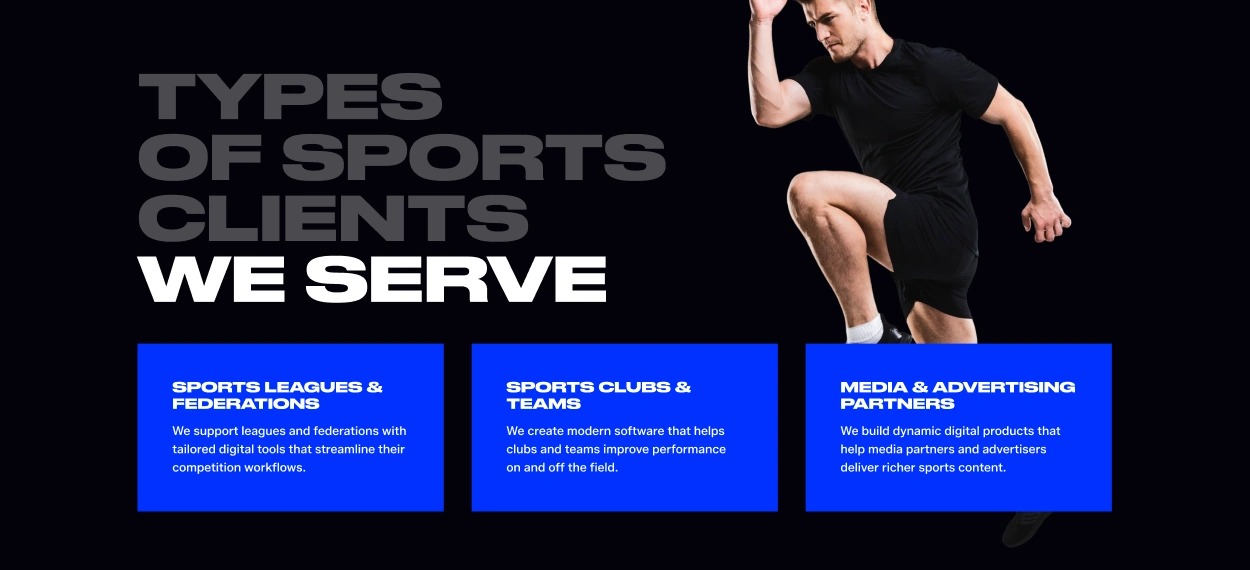
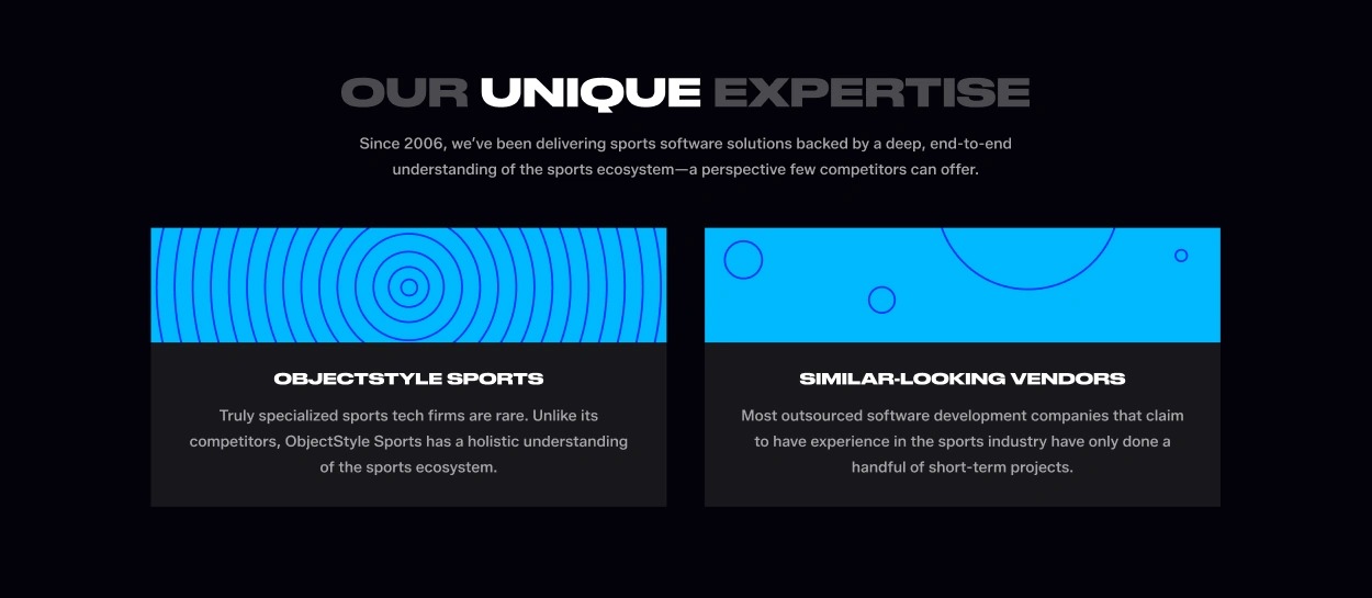
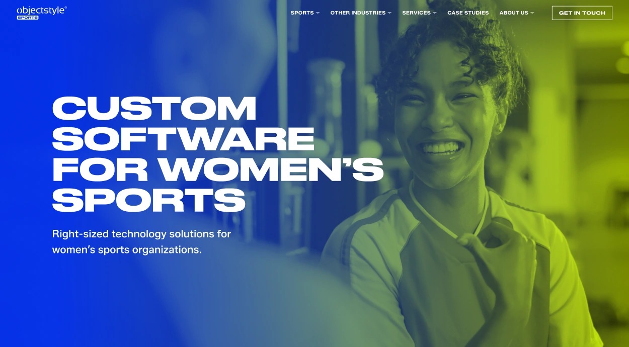
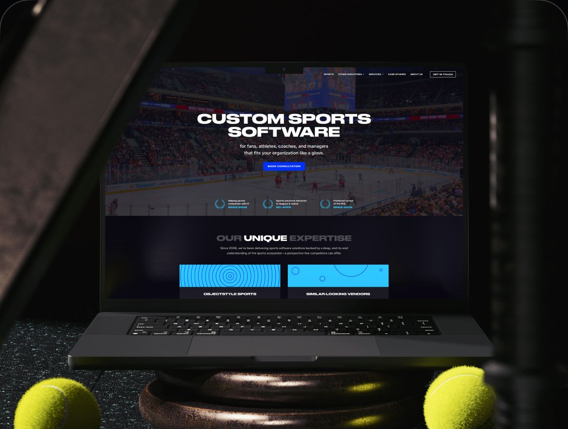
I work on translating brand decisions into a structured design system, including color, typography, spacing, variables, and reusable components.
Figma serves as the visual foundation, while documented design rules and tokens help make those decisions accessible beyond individual design files.
The goal is to create a system that can grow, remain consistent, and support different types of digital experiences.
ObjectStyle Sports Foundations
Drawn in code from the documented tokens
Color colors.json
- Sport Main
- Secondary
- Woman
#FF3B00 brand/objectstyle-main — the parent ObjectStyle orange, kept apart from the Sports accents.
- 1000#000000
- 900#040309
- 800#19181E
- 700#222127
- 600#37363C
- 500#4B4A50
- 400#68676D
- 300#A7A6A9
- white#FFFFFF
Typography typography-*.json
font-family/Druk · Display
Druk Wide Bold
font-family/Zalando · Text
Zalando Sans carries body copy and supporting text, set in sentence case for easy reading.
- font-size/100070 / 60 / 40
- font-size/90040 / 36 / 24
- font-size/80034 / 34 / 20
- font-size/70024 / 24 / 20
- font-size/50016 / 16 / 16
- font-size/40014 / 14 / 14
px: desktop / tablet / mobile. Sizes are shown scaled to fit; values are the documented ones.
Spacing spacing.json
- spacing/14
- spacing/28
- spacing/312
- spacing/416
- spacing/524
- spacing/632
- spacing/748
- spacing/864
- spacing/980
- spacing/10120
px, drawn at 2×. spacing/0 is 0.
Components sport-main-button
Default200 × 50 px
Small160 × 40 px
- Fill background/background-invert
- Label brand/sport-main
- Padding 20 px horizontal
- Gap 8 px
- Radius none