Case study

Designing alanguage-learning experienceacross platforms

Nonsense is a language-learning product that brings together education, technology, and playful experiences.

  • Product Design
  • UX/UI
  • Brand
  • Mobile & Web
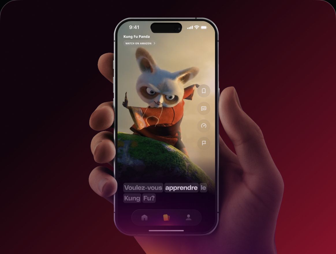
The Nonsense app on a phone held in a hand

Overview

My work spans product design, user interfaces, and visual communication, helping shape a consistent experience across mobile, tablet, and web.

Role
Designer & Builder
Contribution
Product design, UX/UI, brand and visual communication
Platforms
Mobile, tablet and web

The work

01

From product features to everyday interactions

I work on different parts of the learning experience, from individual screens and product features to navigation, visual hierarchy, and responsive behavior.

Each platform brings different challenges. Designing for mobile requires clarity and focus, while tablet experiences offer more space to rethink layouts, interactions, and the way content is presented.

  • Nonsense premium screen: Go Premium and learn 4x faster, with the benefits list and a Continue button
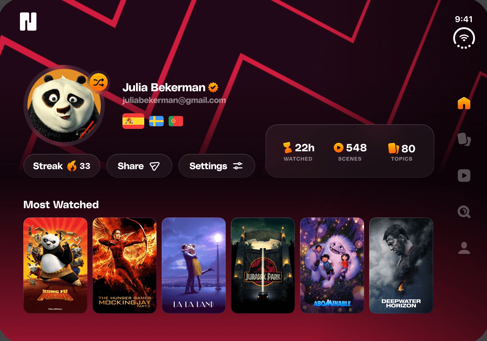
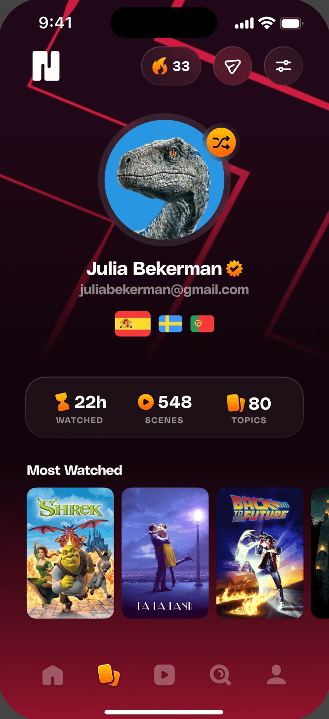
  • Nonsense profile screen with an avatar, flags, watch stats and Most Watched titles
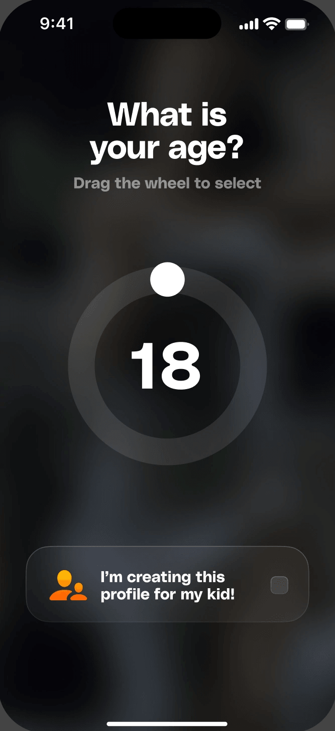
  • Nonsense onboarding screen asking for the age with a circular wheel selector
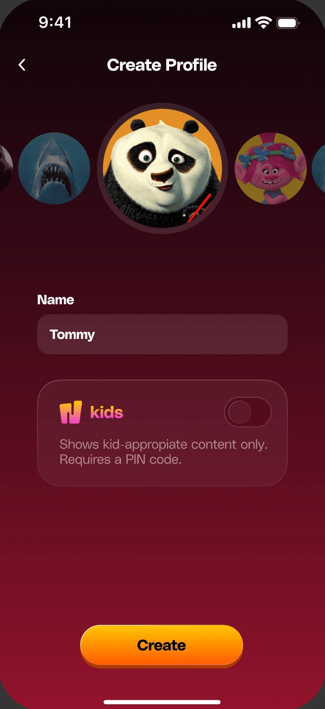
  • Nonsense create profile screen with an avatar carousel and a Kids mode switch
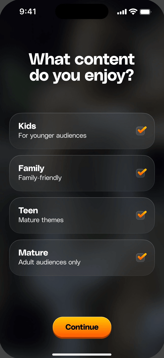
  • Nonsense onboarding screen asking which content the user enjoys
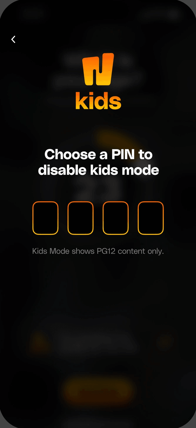
  • Nonsense Kids screen asking for a PIN to disable kids mode
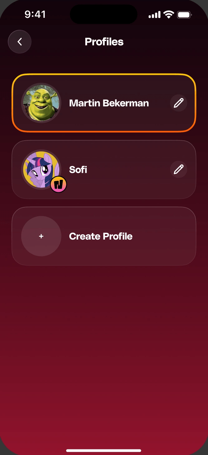
  • Nonsense profiles screen listing the profiles on the account
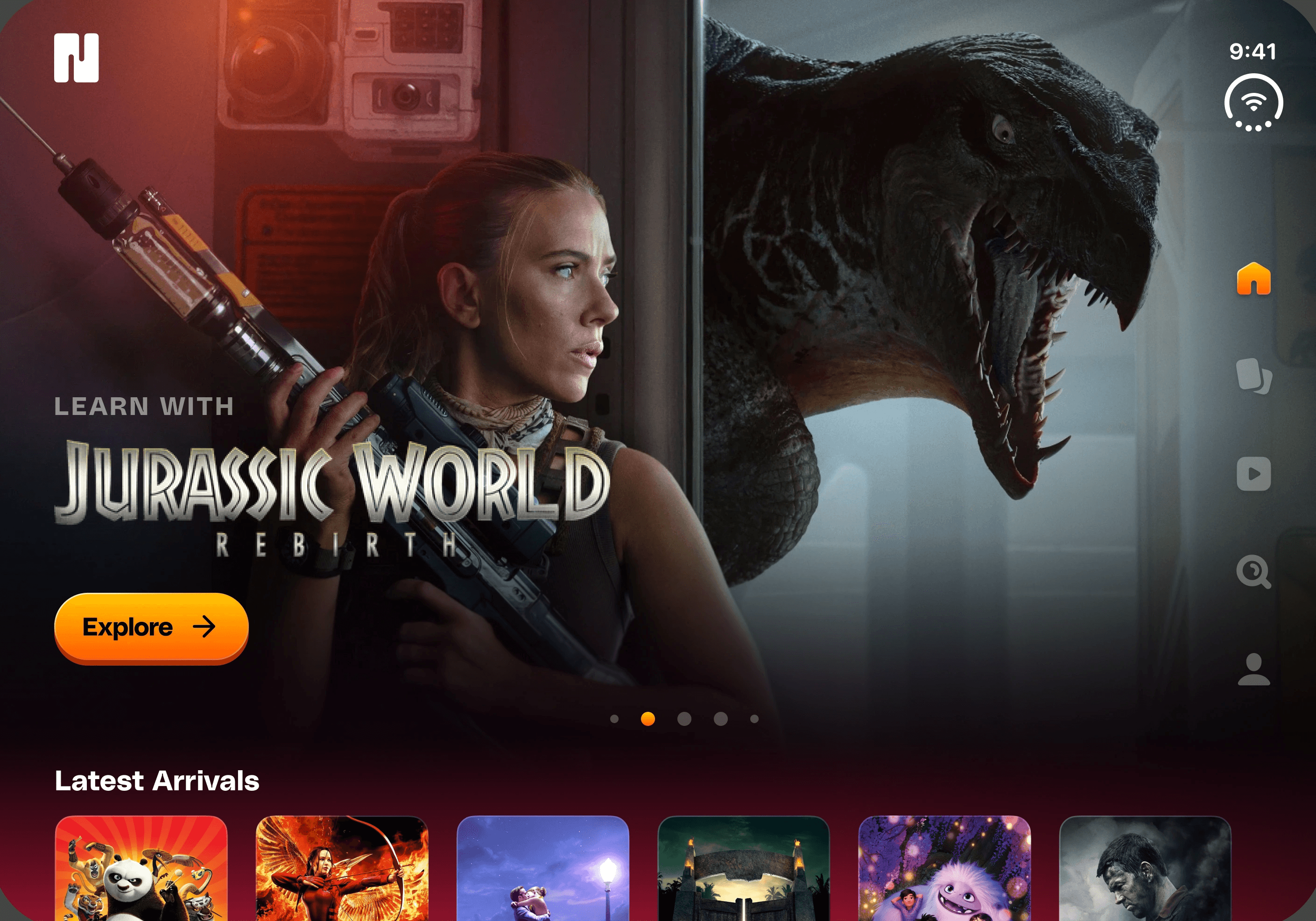
The Nonsense discover screen on tablet, with a featured title and the Latest Arrivals row
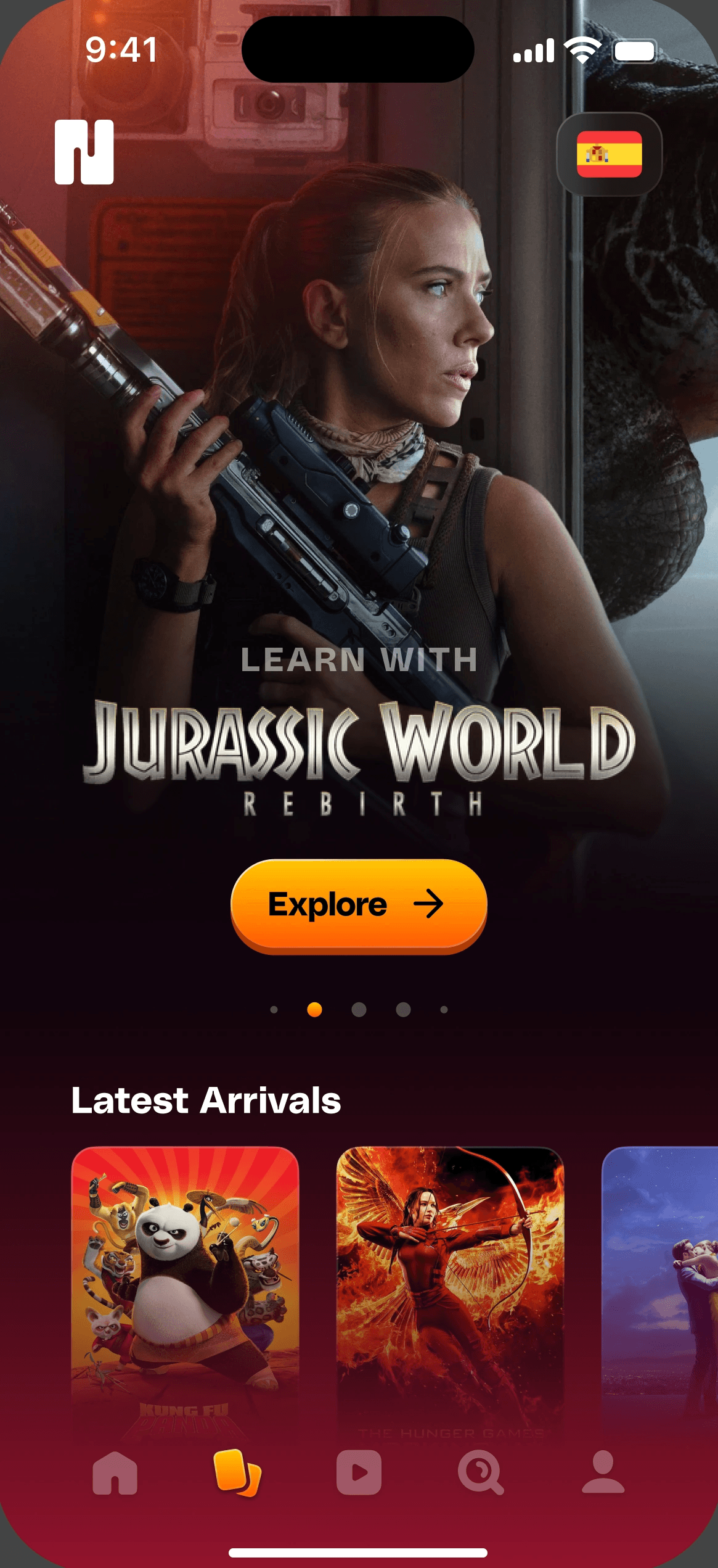
The Nonsense discover screen on mobile, with a featured title and the Latest Arrivals row

02

Building a consistent visual language

Beyond individual screens, I contribute to reusable components, design foundations, and visual patterns that help the product grow consistently.

This includes working with typography, spacing, interface elements, and documentation that makes design decisions easier to maintain and share.

  • Yellow#FFC702brand/primary/yellow
  • Orange#FF5903brand/primary/orange
  • Primary Gradientbrand/primary/orange to yellow
  • Background Gradientbrand/secondary/tint to red-70
  • neutral/neutral-20
  • neutral/neutral-15
  • neutral/neutral-10
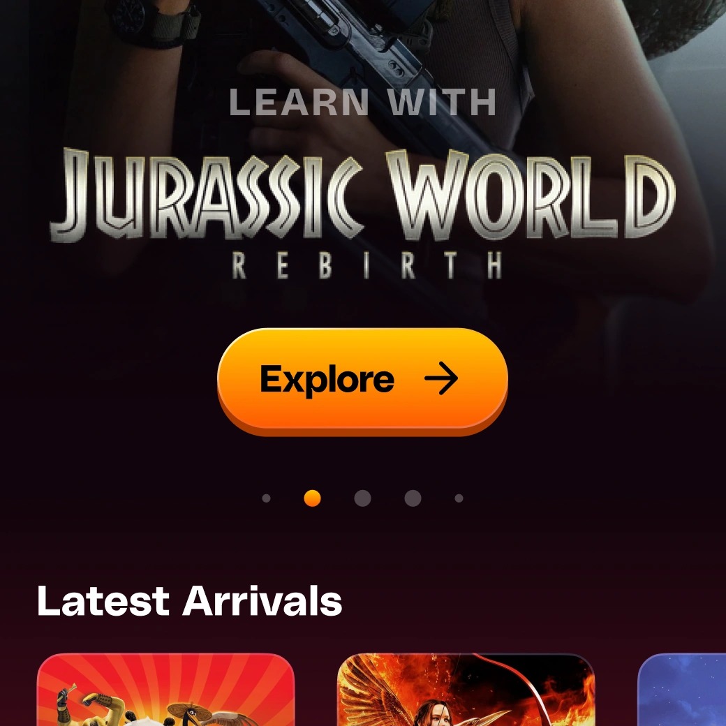
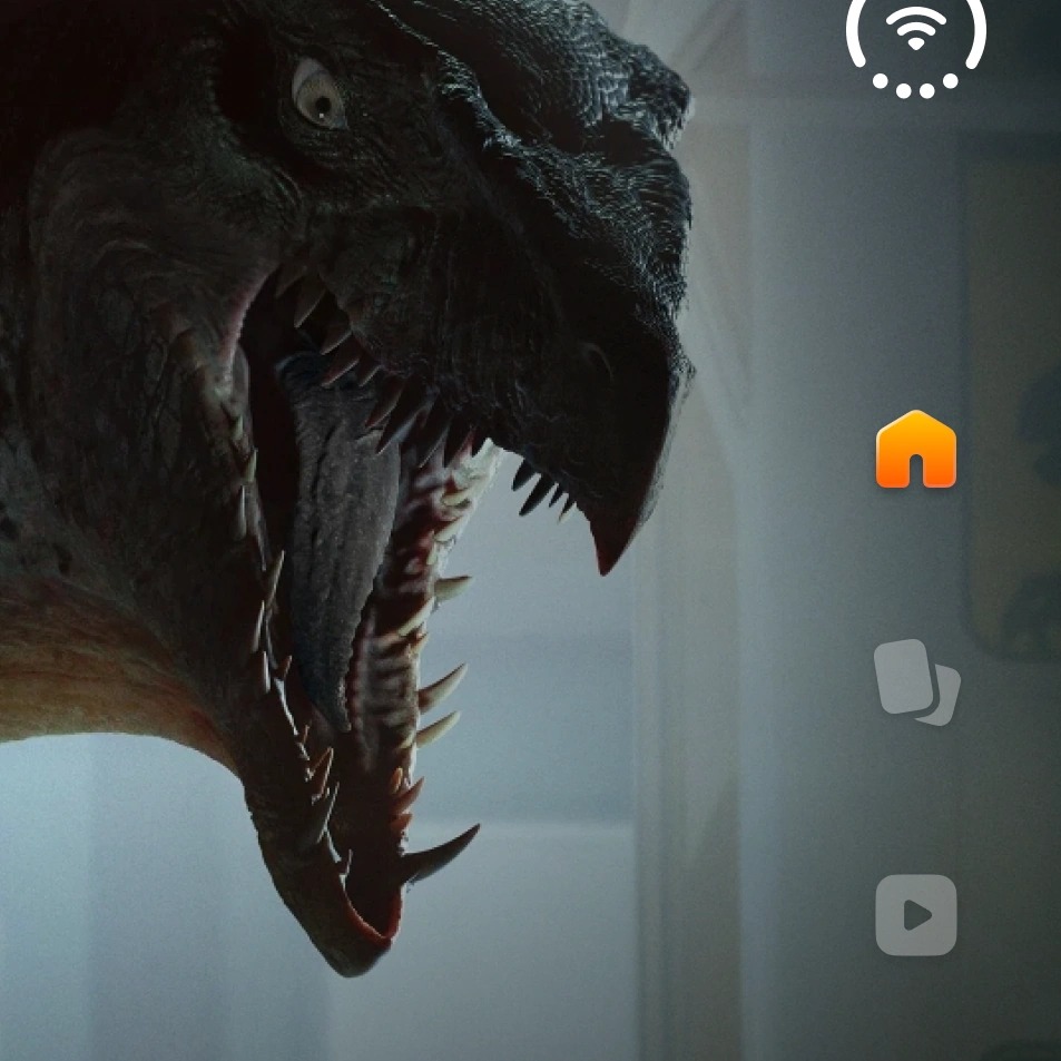
Detail of the Nonsense discover screen: featured title, Explore button and carousel dots
Detail of the tablet layout: status area and navigation rail beside the featured artwork

PolySans Bulky

Mobile

  • Display / Extra Large48 px
  • Display / Large40 px
  • Display / Medium32 px
  • Title / Large28 px
  • Title / Medium24 px
  • Title / Small20 px
  • Text / Extra Large20 px
  • Text / Large18 px
  • Text / Medium16 px
  • Text / Small12 px

iPad

  • Display / Extra Large98 px
  • Display / Large54 px
  • Display / Medium48 px
  • Title / Large40 px
  • Title / Medium36 px
  • Title / Small28 px
  • Text / Extra Large32 px
  • Text / Large24 px
  • Text / Medium20 px
  • Text / Small18 px

03

Bringing the brand beyond the app

My work also extends to Nonsense's digital presence, including its brand website, landing pages, visual assets, and experiences such as Nonsense Kids.

These projects connect product and brand design, creating a recognizable identity across different audiences and touchpoints.

The Nonsense profile on a large landscape screen, with stats and Most Watched titles
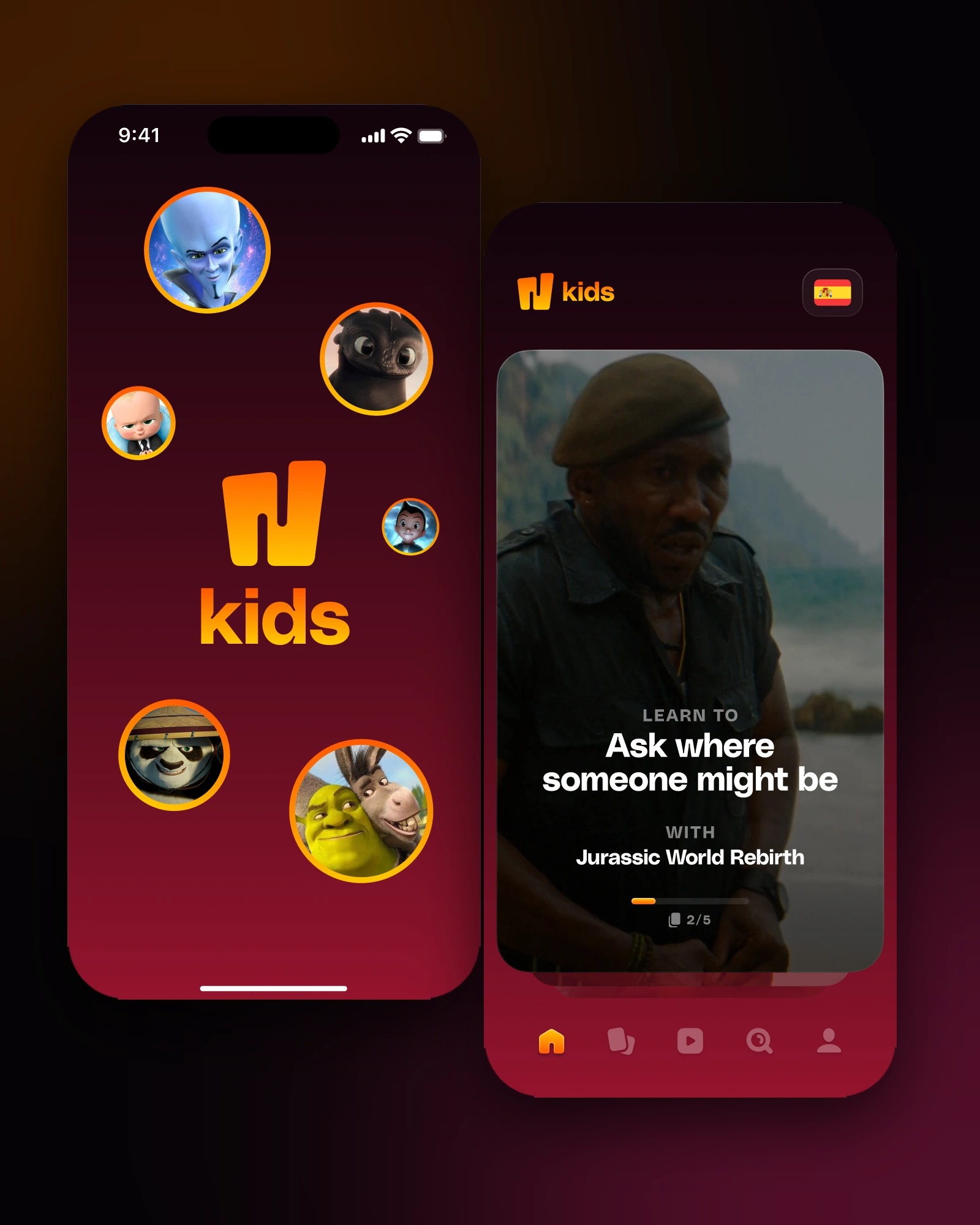
Nonsense Kids screens: the kids profile picker and the kids home
Detail of the Nonsense premium screen: the flame mascot
Detail of the Nonsense Kids launch screen: the N kids logo
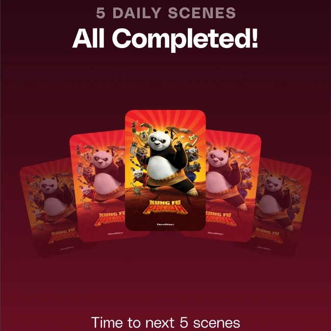
Detail of the Nonsense daily scenes completed screen: a stack of movie cards
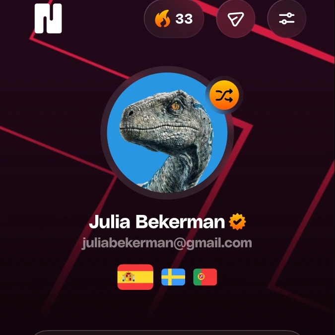
Detail of the Nonsense profile screen: avatar, name and flags

My approach

The work moves between product and brand, but every decision starts from the same question: what does a person need on this screen, at this moment?

  1. 01

    Clarity on small screens

    Mobile asks for focus. Each screen gets a clear hierarchy and only what it takes to move forward.

  2. 02

    Rethink layouts, don’t just scale them

    Tablet has more room, so I use it to reconsider layouts, interactions and how content is presented, instead of stretching the phone version.

  3. 03

    Shared foundations

    Typography, spacing and interface elements are documented as reusable pieces, which makes design decisions easier to maintain and share.

  4. 04

    One identity, many touchpoints

    Product and brand work inform each other, so the app, the website and experiences like Nonsense Kids feel like the same place.

An evolving product

Nonsense continues to evolve across platforms and experiences. My role is to help turn new ideas into clear, engaging, and cohesive digital experiences while maintaining consistency as the product grows.